
Recently we had the opportunity to create a set of  isometric icons for a series of presentations detailing how a data center functions. We began with reference images of various components within the facility, and delivered 20 total graphic icons that can be rearranged to detail a variety of processes within the data center. Below I’ve created a breakdown of how we worked to transform the reference images into graphic icons.
Why Create Isometric Graphic Icons?
Flat vector icons have become very popular among digital platforms over the last few decades, and a more recent trend has been focused on taking those flat designs and making them more visually interesting by adding another perspective. This makes the images more engaging, but also provides more information about the icon itself, and what it represents within a design system. Simple typically wins in terms of experiential design, but with icons sometimes those details can make a big difference in making them more distinguishable.
Step 01: Determine Your Toolset
I created these icons in Adobe Illustrator, but you could follow these steps in similar programs like Photoshop, and Procreate (iPad) to get a similar result. My first step was to build a grid system that I used as a guide throughout the development process. You will also want to make sure that anchor point “snapping” is turned on, so that you are not guessing where to place the points on the guide.
![]()
![]()
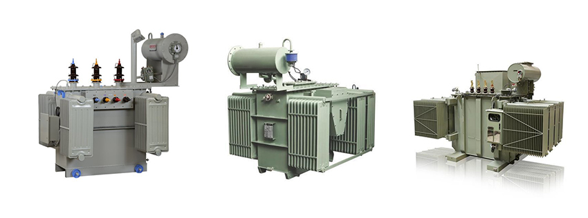
Step 02: Examine Reference Image/Blocking
This second step isn’t always necessary, but for the transformer I chose to block out the design using simple shapes in a few thumbnail sketches to get an idea of how it could be simplified, because it has a lot of details. Once I had an idea of some of the shapes I needed to build the icon I jumped into Illustrator and started building the object with simple rectangles by snapping points into place on our grid system
. 

![]()
Step 03: Add Details
When I had established a solid foundation I made some minor adjustments, and added a few details to really help make this icon represent a Transformer.
![]()
Step 04) Grayscale
In this step we will begin to give the object some depth. Staging the design in grayscale allows us to determine a light source, and examine any inconsistencies in our process. I just found a few shades of grey that created enough contrast to give the design some depth for our client to review before moving into the color stage.
. ![]()
Step 05) Add Color
When selecting a color palette for your icon be sure to choose colors that will create enough contrast for the isometric design to serve its purpose. When the colors are very similar some of the depth will be lost, which can be a stylistic decision, but for this project one of our targets was to create flat images that appeared to be 3D. Below I added some vibrant colors to make our transformer seem a little more ‘electric.’ If you’re interested in learning about how you should be positioning your brand across digital platforms in 2020 subscribe to our blog.
![]()

